I will make no secret of the fact that I am a huge Takeshi Murata fan. Ever since I bore witness to the throbbing intensity that is “Cone Eater” in 2006, I’ve been hooked. His “Monster Movie” was a breakthrough piece for the after-aftereffects generation, which singlehandedly gave birth to the now ubiquitous “datamosh” technique. (Props to Jacob Ciocci for coining such a brilliantly post-Hot Topic moniker). His short animations “Melter 02” and “Tarpit” were perfectly executed explorations in controlled psychedelia, eschewing the “shit maximal” aesthetic he had come to be associated with (see: Providence, 2003 et al).

Takeshi Murata - still from "Melter 2", 2003
But then, I stopped paying attention. And unfortunately, from about 2008 until today, I hadn’t heard the first thing about Murata or his new work. Now that I have, I’m kicking myself for sleeping on it. Murata’s new show at SF’s Ratio 3 gallery (which just so happens to be my new neck of the woods) is an amazing evolution, an exhibition of large-format prints, each a confounding and witty still-life, composed entirely on the computer.

Takeshi Murata - "Art and the Future ", 2011
Murata’s new direction shows a honing of nerdly computer chops and a practice of new compositional restraint. Each piece is thoroughly bizarre mix of real and imaginary objects, in glossy, slicker-than-life detail. A pristine fantasy assemblage sprinkled with frighteningly appropriate everyday bullshit, like the a stoner’s bedside table on Rinse Dream set pieces. While past work was experiential and process-oriented, the vocabulary of forms present here invites interpretation, with tongue-in-cheek echoes of Oldenberg, McCracken, and even a Duane Hansen-esque hyperreality.

Takeshi Murata, "The Heretic", 2011
The VHS-worship of the contemporary media arts scene is present, but dialed back (The “Total Recall”-referencing title of the show notwithstanding). It’s not about “memory vague” nostalgia-noise or post-digital downsampling, but a intentional juxtaposition of objects in dramatic nothingness (the emotionally charged vapidity that is “the experience of cinema-space” in so many of our shared memories). The inclusion of the books “Art and the Future” and “Expanded Cinema” are obvious in-jokes, reflecting the fall of critical discourse in the face of the free-for-all instant-publish world of style-jacking that is creativity 2.0.

Takeshi Murata - "Jazz Funeral", 2011
The exhibit is on display til June 11th @ Ratio 3 in SF.
Filed under: Uncategorized | 1 Comment
Tags: q
Swatch: Modernism’s last stand
Correct me if I’m wrong, but to me, and to many of the godfathers of the modernist movement (Maholy Nagy, le Corbusier, Eames, et al), the concept of “modern design” has always been subliminally charged with a smattering of utopian ideals. Great design is good, sure. But great design for everyone is better. (Ikea apologists take this how you will). While dropping 4 grand on an Eames lounge is fine as an act of ancestor worship, the longstanding ubiquity of the Aalto stool packs more cultural punch. To me, no single 20th century product managed to encapsulate all that is good about “the modern approach” more than the Swatch watch. The trendy-turned-iconic design of the classic plastic Swatch has somehow managed to endure as a simple, well-made, affordable, repairable, and endlessly relevant accessory for the better part of 30 years.
Swatch as a company and a product came into being in 1983 or so (long after what anyone would tell you was modernism’s golden age), predicated, (as all great designs of the 20th century were) by a leap forward in technology. A crew of Swedish engineers cooked up a super-thin analog watch with a plastic body, hoping to take steam out of the over-saturated Japanese digital watch market, which was hogging all the futurist spotlight. They used the plastic backplate as the main movement plate, joined tiny parts with ultrasonic welding, made the whole thing waterproof, and reduced the overall number of parts from around 90 to 51 with no reduction in overall accuracy.
Apart from the engineering standpoint, Swatch as a brand was way ahead of its time in the marketing department. The meticulous mechanical efficiency made the new watches cheap to produce, and having created their own market niche, Swatch was decidedly adventurous when it came time to sell the things. Here’s how:
Watch as accessory:
The ability to sell a nicely-functioning wristwatch for under $50 gave the swatch brand instant pop-culture appeal. Unlike most things boasting of their Swiss pedigree, Swatches ditched any kind of dour snobbery in favor of disposable glam. The first few collections were about as 80s possible, in grid patterns, memphis-lineage pastels, and new-wave color pops. Interchangeable bands and stretchy rubber face protectors made the watches themselves eternally updatable, a “make it yours” counterculture nod masking a capitalist masterstroke.

Fresher than New Coke.
Collaboration:
The basic Swatch idiom for the company’s first years of life might be summed up as “variations on a theme”. The almost immediate market response to Swatch’s first few collections vaulted the simple design to “icon” status in no time, as customers bought up dozens of designs all built on the exact same platform. The Swatch had quickly become an a priori blank canvas, and starting in 1985, the company started inviting artists & designers to make their marks. Although the idea of artist collaboration is everywhere these days, it was an almost absurdly prescient move 25 years ago. While today you might rock your Pushead x Nike dunks on your Obey x Fuji fixed gear without batting an eyelid, the 1985 Keith Haring Swatch collection was mind-meltingly fresh.

Boo Ya.
Collector Cult:
While “collectors editions” have been a marketing gimmick since the dawn of time, Swatch pushed the envelope with the debut of “club swatch” in 1990. Probably because the street-level hype and sales figures had started to die down, Swatch established an elite club, inspiring Otaku-level nerd passion for limited styles. Once a year, club members are offered the chance to purchase watches limited to a few thousand, and available only in flagship Swatch retail spots. These “club Swatches” laid out chronologically make an impressive cross-section of the aesthetic and conceptual territory the brand has covered in its 28 years of existence.
After digging through dozens of internet forums and RARE OOP eBay listings, I found a few example models that really embody the far-reaching conceptualism of the Swatch brand, and its ability to be unflinchingly trendy yet totally next-level.

Grey Memphis Swatch 1984
First up is this stark little gem from 1984. The connection between Swatch and Memphis design makes perfect sense, and made for some truly awesome designs. This one is a rare grey variant of an Alessandro Mendini design. The face looks like a charred funhouse, and those green and pink hands scream “for mutants only”.

Paella Swatch by Natalie du Pasquier
Another Memphis heavy hitter here, from the early 90s. Natalie Du Pasquier was the Memphis group’s main fabric designer, and her textiles are some of my favorite patterns ever. Can’t say I’m bowled over by this watch, but I appreciate the effort. It’s definitely riding a “radical architecture” vibe, but the restrained color palette and symmetry keep it just below “legedary” status.

Rated X Swatch 1987
FOR MY FRIENDS. FOR MY FAMILY. FOR MYSELF. STRAIGHT FUCKING EDGE. Random cross-pollination or genius ear-to-the-subculture marketing move? you decided.

9 to 5 Person Swatch 1999
Nothing but pure dot-com era hubris here. This watch from 1999 reads “I am not a 9 to 5 person” across its length. Anti-corporate attitude for alterna-business entrepenuaers.

White Card Swatch 1999
“The last Swatch of the 20th century”. Slick fascist-style typography for this end-of-days beauty.

Nam Jun Paik Swatch 1996
Titled “Zapping”, this model was designed by veteran A/V explorer Nam Jun Paik, and plays sound of his devising. The bright space-lego green body and CRT bricolage band give it a real “Aliens ate my TV” vibe.

Ice Dance Swatch 1995
CALL A FRIEND. TAKE A CAB. FIND A CLUB. STAY UP LATE. RIDE THE GROOVES. An ice-cold post-Neville Brody trance accessory.
(Note: Most images borrowed from swatchandbeyond.com. I encourage you to dig around for 100s more confoundingly bizarre styles, and maybe even buy one)
Filed under: Uncategorized | 3 Comments
One of my favorite miners of junk culture past and present is Travess Smalley, a young artist (my age, in fact) who’s laser-sharp appropriations of mass media & tech crud are at once witty and compelling. Working mostly in the 2d realm, Smalley wields a Memphis group mentality, exploring patterns, shapes, and production methods from the tackiest corners of the last 25 years. Default graphics swatches, Photoshop brushes, hastily implemented photo effects, magic eye posters, and primative 3d graphics are melded, isolated, magnified, and overstated into works that exude a sort of atavistic minimalism.

Smalley excels at reducing over-used graphic strategies like gradients, posterization & drop shadows (which are so ingrained now into our visual culture that they register as background noise) into high-impact statements. These montages and tableaus, as frivolous as they may seem, provoke speculation about the simultaneously dizzying and stultifying effect of computer-based creation.

While other artists working in these realms tend to embrace visual overload as their leitmotif (the internet as a torrent of technological garbage), Smalley gives each idea room to breathe, with the eyes and conceptual simplicity of a true modernist. Though the Donald Judds of the world would scoff at the format-hopping impurity of his work, he is a true reflection of art in the internet age. When 2001 years of art history are flattened to an iPad-shaped Black Obelisk, polymorphism is the name of the game.


As a culture, we have become blind to the long lasting effects that software such as Photoshop, Maya, and the like have had on our visual vocabulary, and collective unconscious. Smalley’s simple experiments, vacillating between stark pattern planes and reference-saturated assemblages, draw attention to both the peculiar idiosyncrasies and understood legitimacy of these truly bizarre formats.

Filed under: curated | Leave a Comment
Tags: design, graphics, junk culture, photoshop, smalley, travess
In Defense of Junk Culture pt.1
Junk culture is all around us. For most Americans, it’s hard to ignore. Many academic, “creative class” types like myself do their best to ignore it, however, retreating to shadowy “high culture” enclaves like “ART”, “DESIGN”, “FASHION”, and other capitalized arenas of human expression. Having gone to school for Industrial Design, I understand the urge to sequester oneself to a world populated only by beautiful things, fulfilling a romantic desire for a certain “utopian” existence.
Though it took me a few years to open myself to it, junk culture is important. The essential ying to the creative world’s sober yang. Not to be a champion of amateurism over mastery, or recidivism over intellectualism, but a balanced outlook, a “cross-brow” approach, if you will, opens up new worlds. Once a creator or aesthete moves beyond “good” and “bad” definitions towards a holistic, hierarchical appreciation, delineated only by his or her own motives, true inspiration flourishes.
Case in point: Memphis Group. Started in 1980 by modernist heartthrob Ettore Sottsass and his designer/architect pals, Memphis pieces embraced the tackiest, most obnoxious elements of 1950s kitsch and bad taste, exploding forth in a flurry of imagination, that truly shocked the design world for years to come. So totally bold and NOW that the entire movement came crashing down within 6 years. A true testament to junk culture frivolity, gleaning not only the aesthetics of bad taste, but the temporality of all fads & gimmicks, and the power that dwells within the shock of the new.
The internet, by far the most important cultural development of the last 30 years, has served to flatten culture to a level never before dreamed. Now, distinctions of taste and class are free to co-mingle without boundaries. This revolution has served junk culture well. Being so bombarded with pop-up ads, insane surveys for shadowy prizes, and computer-conceived friend requests has made even the most glassy-eyed user aware of the quagmire of junk that spews from our collective unconscious.
Our web 2.0 world has inspired a whole host of new artists and general culture-mongers to emerge from the shadows, and wholly embrace the alien surrealism of junk culture, and I for one couldn’t be more stoked.
(Next up: An outline of a few of my favorite cultural trash-sifters currently making the scene)
Filed under: created, curated | Leave a Comment
Tags: cross-brow, design, junk culture, memphis, sotsass, surrealism, trash humpers, web 2.0
Metal Music Machines
The cover story on last week’ Pittsburgh City Paper was an interview and profile on artist/roboticist Eric Singer, a Carnegie Mellon alum and recent Brooklyn -> Pittsburgh transplant responsible for the founding of LEMUR (the League of Electronic Musical Urban Robots). His creations employ robotic actuation of acoustic elements, functioning under pre-composed sequences, in a sort of “robotic orchestra”. He’s collaborated with fusion guitarist Pat Metheny and library-rockers They Might Be Giants.
Singer is just one of the artists working in what can now be considered a tradition of “musical robotics”, exploring the limits of electronic automation within musical systems.
Singer’s approach is an outsourcing of musical performance to non-human players, allowing a human counterpart the opportunity to improvise or elaborate upon these themes, as a soloist. A similar approach is utilized by Pierre Bastien, a French musician who builds and performs alongside simple mechanical sound-sculptures.
In contrast to LEMUR’s high-tech, engineered creations, Bastien’s devices are romantically simple. Consisting often of erector-set like mechanisms put into motion by old turntables, his machines have the distinctive style of a tinkerer’s workshop. Wobbly, maybe even dusty, but charming in an “island of misfit toys” kind of way.
Operating on the complete opposite side of the robotic performance spectrum is Survival Research Laboratories, beloved outlaw forefathers of robotic performance, and the “industrial aesthetic”. Founded by Mark Pauline in 1978, and still active today, the group crafts politically-charged performances on a larger-than life scale, where huge, threatening machinations destroy themselves on backdrops of crumbling industry.
Although the emphasis is on the physical performance, the group has released several albums and compilation tracks, made up mostly of field recordings of the metal carnage. Whereas LEMUR’s robots perform the jobs of human musicians with machine accuracy, SRL focuses on the anti-human aspects of robotic performance, allowing the machines to speak and act “for themselves”, in a brutal language of their own.
Tom Grimley, an LA musician and electronics experimenter, is a firm believer in machines speaking their own languages. An ex-member of 90’s geek-rock darlings the Rentals, Grimley has spent the past few years touring with his “automated electronic music ensemble”.
Grimley’s mysterious boxes are assembled and interconnected in real time, as part of the performance. The human element is merely as “benevolent caretaker”, giving life to the machines, and allowing them to squeak and squawk amongst themselves. Though not technically robotic, (but definitely cybernetic) the self-regulating circuitry of the performers determines their vocabulary and cadence, while human interaction is intentionally restricted. This is truly a music by machines, for machines.
The variety of aesthetic approaches to machine-performance that have emerged in the 30-odd years since its inception is impressive. From the novel precision of mechanical musicians to the obtuse language of self-serving circuitry, it will always be captivating.
Filed under: curated | Leave a Comment
Tags: automation, bastien, cybernetics, grimley, LEMUR, pierre, robotics, srl, survival research labs, tom
It’s been quite a while since I’ve had a true synth-nerd moment. Having been an analog/modular buff since high school, but lacking the funds and general pro ‘tude of a true musician, I rarely get fired up about the synth market these days. The last time I got my hopes up was about the Hartmann Neuron , which turned out to be kind of a Fairlight/Synclavier-style “audiophile” platform, prohibitively expensive and exclusive, built for only the smoothest synth freaks in the biz. Lately, I’ve been submerged in nostalgic-retro sonics, which have been sweeping the American DIY underground with great success for the past 2 years or so. But now, I’ve emerged from my audio cave of blissed-out 80s polyphonics and chorus-drenched arpeggiations to wax on about a truly original piece of new-tech, exhibited at NAMM 2010 last month.

I will go on record to declare that the OP-1, a new portable synth/sampler/sequencer/controller from Sweden-based Teenage Engineering is without a doubt the most exciting electronic object I’ve seen in a while.

First of all, and probably most importantly, this thing is beautiful. Equal parts Macbook Pro, Olivetti calculator , and Casio VL-Tone (the last truly portable, truly bizarre synth to grace the market). Flat, compact profile, color-coded knobs and buttons, one-piece solid milled-aluminum chassis, super-sleek hi-res AMOLED display, and nothing but precise, clean lines all around. Stockholm’s really giving post-iPad Cupertino a run for its money on this one.


As great as it looks, though, its the totally next-level functionality that’s got the internet switchboards all lit up. Sure, it’s got a couple different synth modes including string synth, fm, analog modeling, pulse wave modulation, and some real slick-sounding head-scratchers like “T10” “PSE” and “Cluster” (obviously the most cosmic of the group). And yeah, it’s got a super-simple sampling interface (think SK-1, but more Web 2.0). And sure, you can add envelope control, and program 4 separate sequencers, all represented visually in brilliant, TRON-style neon-on-black colorways. But that’s just the beginning. In a true stroke of genius, the hypnotized minds behind this little jammer dreamed up a feature they call “TAPE”. What is “TAPE?” you might ask? Live, dynamic tape-deck emulation, of course. Check out some sample videos, for some truly chopped n’ screwed sonics. I seriously can’t over-state how great of a concept I think this is. Record every keystroke, tweak and sequenced sound live – then rewind, slow down, filter, over-dub, cut n paste, wreck n effect.
The Teenage Engineering developers kept this landmark feature secret for almost a year, finally unveiling it at this year’s NAMM, after the OP-1’s debut at the Frankfurt Musik-Messe in 09. Other innovative, state-smashing features include a built-in FM radio tuner as a sound source, routable accelerometer control (for Keith Emerson-style histrionics), usb connectivity, and top-secret wifi capabilities. The capacity for live performance and sheer audio insanity are near limitless.
No price set yet, and no release date, but damn if everyone isn’t clamoring. If this one gets lost in the shuffle, I’ll never forgive them. Finally a cross-brow device for academic explorers and underground knob-freakers alike.

Hit up Teenage Engineering for more delicious details.
Filed under: curated, Uncategorized | 2 Comments
Tags: design, gadget, next level, synth, tape, teenage engineering, underground
album covers – ghost box
Another great record label with its own resident designer/musician is the UK’s Ghost Box, which I read about in an issue of The Wire from last year. Julian House does all the label’s covers, drawing on the traditional layout of paperback publishers like Pelican for a “institutional-retro” look. As stated in the label’s manifesto, the music of Ghost Box artists references “music for schools, cosmic horror stories, library music, English surrealism, and the dark side of psychedelia.” All of which is palpable in the nostalgic feel of their album covers.
Mount Vernon Arts Lab – The Seance at Hobs Lane:

The Focus Group – We are All Pan’s People:

Belbury Poly – The Owl’s Map:

The Advisory Circle – Mind How You Go:

The Focus Group – Hey Let Loose Your Love:

Eric Zann – Ouroborindra:

Belbury Poly – The Willows:

The Focus Group – Sketches and Spells:

Belbury Poly – Farmer’s Angle:

Filed under: curated, Uncategorized | 1 Comment
Tags: Record Covers Ghost Box
book covers flickr page
Hey there. I’ve continued collecting and archiving cool book covers, but they are now all on my flickr page, right here , instead of on this here blog. Thanks!
Filed under: Uncategorized | Leave a Comment
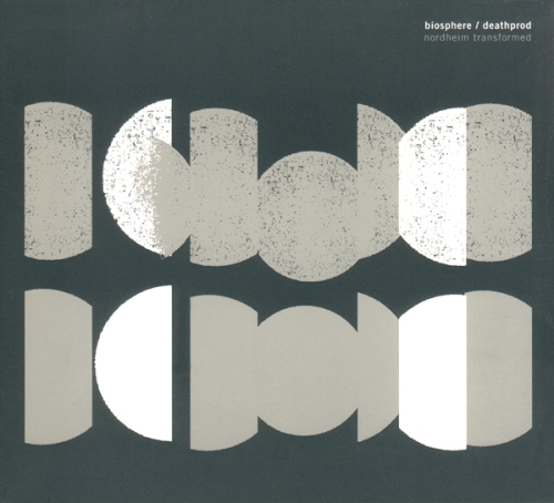
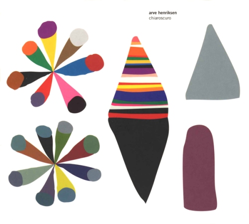
album covers – rune grammofon
Kim Hiorthøy is the principle graphic designer for all releases on the Norwegian label Rune Grammofon. I stumbled across some of his designs while browsing Mimaroglu Music Sales, an amazing distro run by sound artist Keith Fullerton Whitman. Hiortøy’s work is amazing, and reminds me of the simplicity and attention to detail of all my favorite 60s/70s book covers. Here’s all the decent- resolution album art I could find (mostly from discogs.com ). Enjoy!
Arne Nordheim – Electric:

Biosphere/Deathprod – Nordheim Transformed:
Food – Veggie:

Arve Henriksen – Chiaroscuro:
Moha! – Raus Aus Stavanger:

Various Artists – Runeology 2:

In the Country – This was the Place of My Heartbeat:

Jono El Grande – Fevergreens:

Phonphani – Genetic Engineering:

Arve Henriksen – Strjon:

Moonlight – Free Music:

Filed under: curated, Uncategorized | 1 Comment
Tags: graphic design album covers
procedural camouflage
I recently finished a programming project in the Processing programming environment, which I just started learning this semester. I created a program which will analyze any image file, and spit out a tile-able swatch of camouflage based upon it.
The program selects 5 predominant colors from the image, weights them, and creates a background of color, and a number of colored blobs, whose size is determined by the prevalence of their color in the original image. The complexity of the blobs is determined by complexity of the contours in the image, and the transparency is determined by the range of colors represented in the image (this way, low-contrast images render “blurry” patterns).
The results aren’t extremely consistent, but pretty interesting nonetheless. Below are displayed several original images (scraped from google), each followed by a few swatches of camouflage produced by the program (which outputs square pdfs). I used landscape-type images, because they are a logical choice for camouflage, but as you can see by the last example, the program can be used to intriguing effect with any source image.
Source Image:

Procedurally Generated Swatches:


Source Image:

Procedurally Generated Swatches:


Source Image:

Procedurally Generated Swatches:


Source Image:

Procedurally Generated Swatches:


Filed under: created, Uncategorized | 3 Comments
Tags: art, camo, camouflage, design, processing
